Bittrex Product and Marketing
To mark Bittrex’s sixth anniversary, I led a product and brand exploration focused on clarifying where the platform was headed and how it should feel to use, not just how it should look. The goal was to re energize the Bittrex experience from the inside out by grounding visual decisions in user needs and platform complexity.
I began with research, interviewing founders, employees, and customers to understand how people experienced crypto trading, where they felt overwhelmed, and where the platform could better communicate trust, control, and clarity. This research surfaced a core tension in the product: Bittrex operated highly sophisticated trading systems, but users needed those systems to feel coherent, intuitive, and dependable.
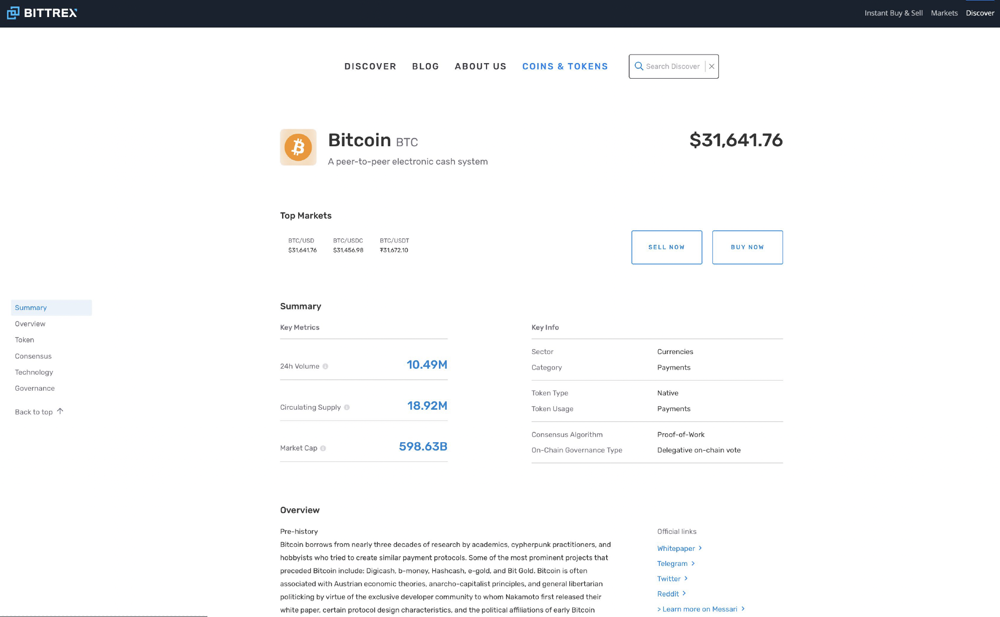
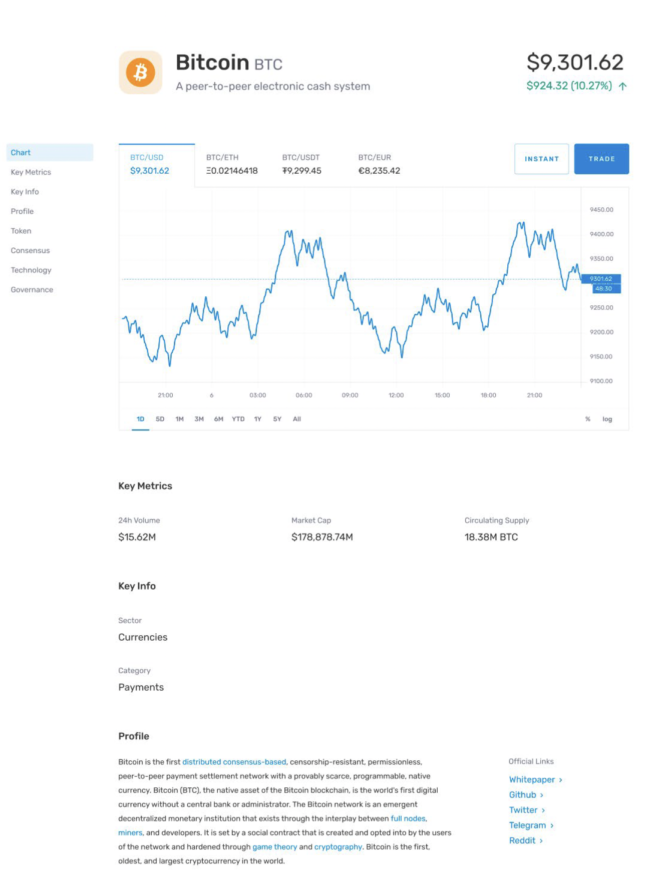
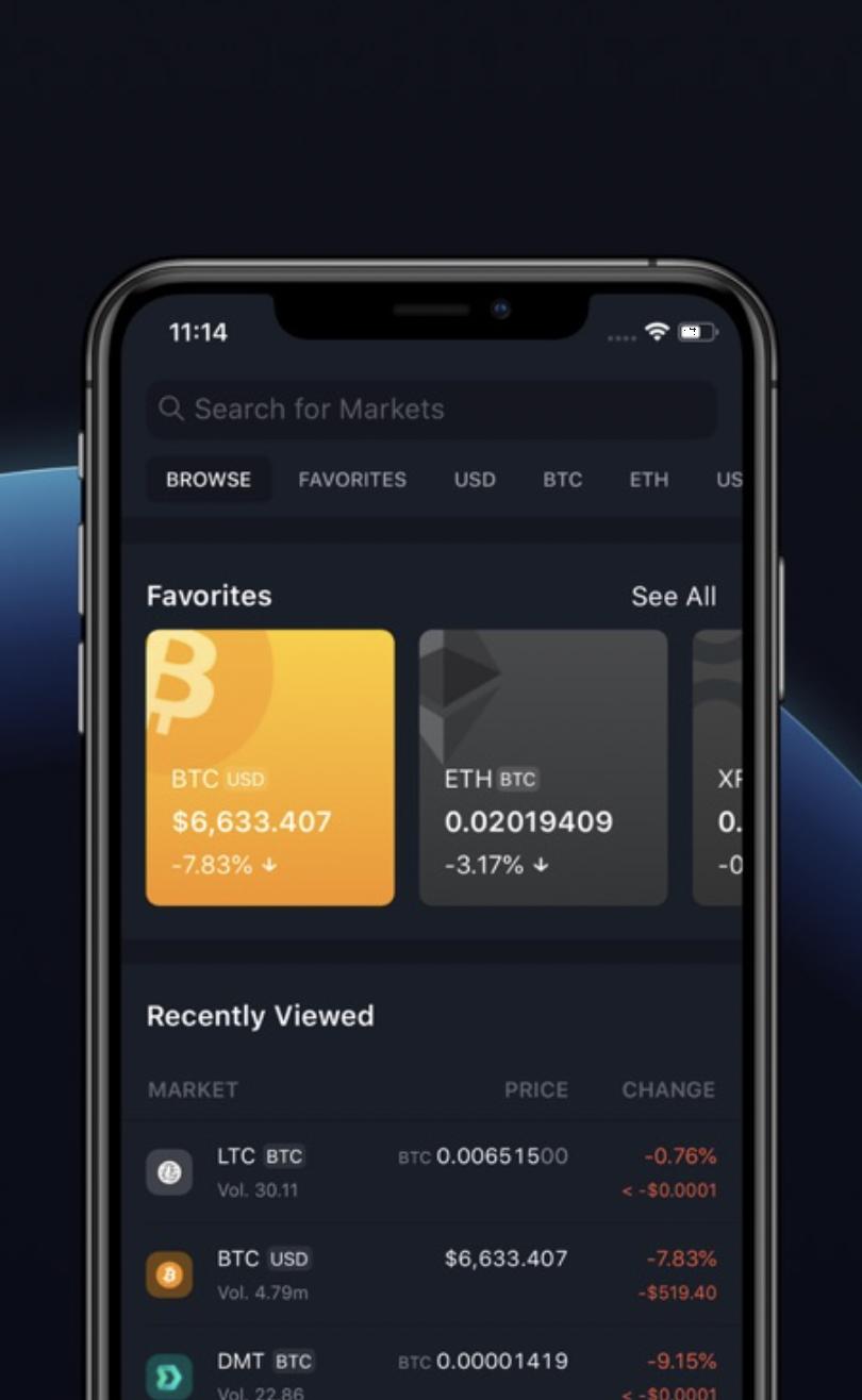
That insight became the foundation of the design direction. We defined Bittrex’s value as its ability to transform complex, technical systems into structured, understandable experiences that help users confidently engage with new technology. The refreshed identity was designed to reinforce this idea across the product, not just marketing.
The logo system reflects this product mindset. A “bit,” representing the fundamental unit of information, sits at the center, symbolizing the core product and its stability. Surrounding it are directional forms that suggest expansion, movement, and progress, reflecting how the platform enables users to explore new markets while remaining grounded and secure. The system communicates motion and growth without sacrificing focus or trust.
We extended this thinking across the broader product and brand system, simplifying visual language, refining interaction patterns, and introducing a more human tone. A clearer color palette, reduced visual noise, and more approachable messaging helped make complex concepts easier to understand and reduced cognitive load for users. The result was a more cohesive, scalable design system that better aligned the product’s functionality with its promise to guide users confidently through an evolving crypto landscape.