A Good Fckn Day
A Good Fckn Day is an independent product design case study for a spontaneous day planner. The iOS and responsive web experience turns a few signals about time, energy, company, and budget into a practical local or travel itinerary.
A Good Fckn Day
Less planning. More day.
A spontaneous day planner for the familiar question: “What should we do today?” I designed and built an iOS beta and responsive web companion that turn a few details about the moment into a day worth getting out for, whether you are home or traveling.
THE PROBLEM
Finding something to do is rarely a shortage of options. It is the work of comparing places, checking distance and hours, balancing a budget, and getting everyone to agree. That friction can turn a free afternoon into more scrolling than doing.
THE PRODUCT IDEA
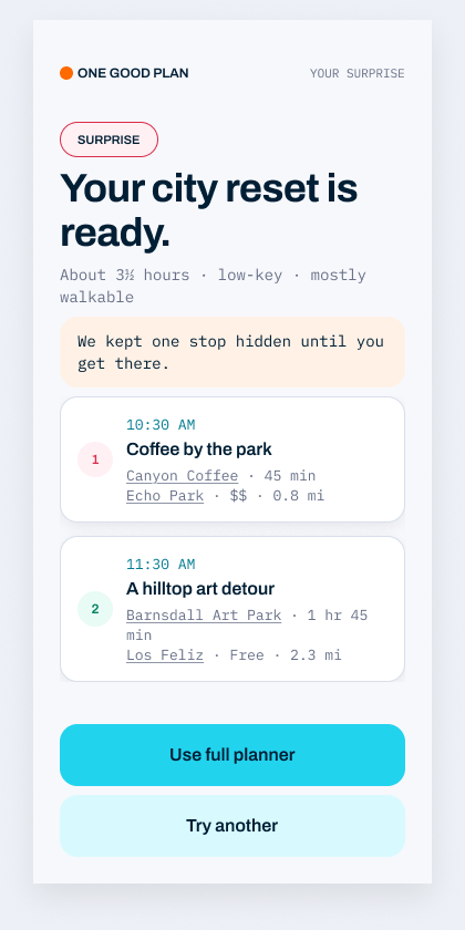
Instead of another list of things nearby, the product makes a plan. People can share where they are, how much time they have, who is coming, their energy, and a comfortable budget. The experience then proposes distinct ways to spend the day with a practical sequence of stops. A lighter “Surprise me” route keeps the spontaneity for people who do not want to answer a full set of questions.
DESIGNING THE JOURNEY
I kept the setup short and made each question earn its place. The flow moves from context to a clear itinerary, with alternatives when the first idea does not fit. The result brings pace, location, and cost into one view, then lets people open places in Maps, share the plan, or add it to a calendar. The goal is confidence to leave the house, not another planning task.
BUILDING A COHERENT SYSTEM
I created the product model, mobile and web journeys, visual identity, and reusable UI patterns together. The design uses a direct editorial voice and clear hierarchy so the experience feels playful without hiding practical details. I carried the concept into a working iOS beta and responsive web experience, refining the screens and plan logic as the product took shape.
CURRENT STATUS
This is an independent product in beta, not a launched growth story. The work demonstrates end-to-end product judgment: framing the problem, reducing decisions, designing the interaction, and bringing the experience into a usable build. The next step is physical-device testing and learning from real planning sessions before making impact claims.
ROLE
Independent product designer and builder
PLATFORMS
iOS beta · Responsive web
PRODUCT AREAS
Day planning · Local discovery · Travel exploration · Itinerary design · Sharing
DESIGN & SYSTEMS
Product strategy · Interaction design · Prototyping · Visual identity · UI system · Front-end implementation
PRODUCT MODEL
A few useful inputs · Distinct plan options · A spontaneous shortcut · An actionable itinerary
STATUS
Working beta · Physical-device testing and validation next
FROM A FEW SIGNALS TO A DAY OUT
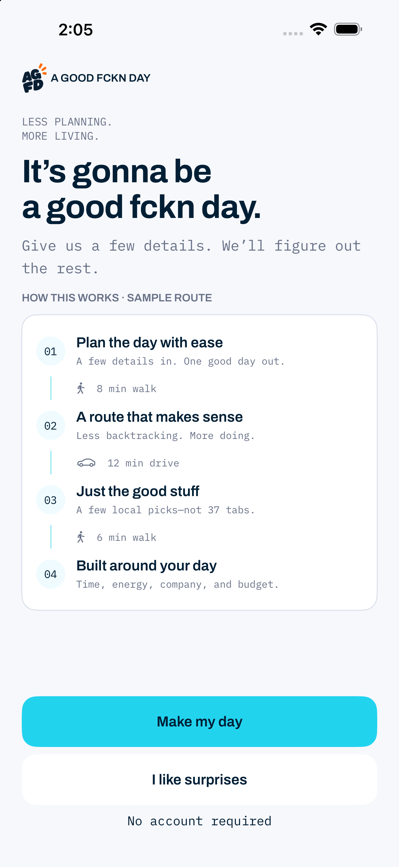
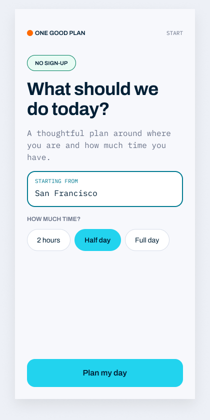
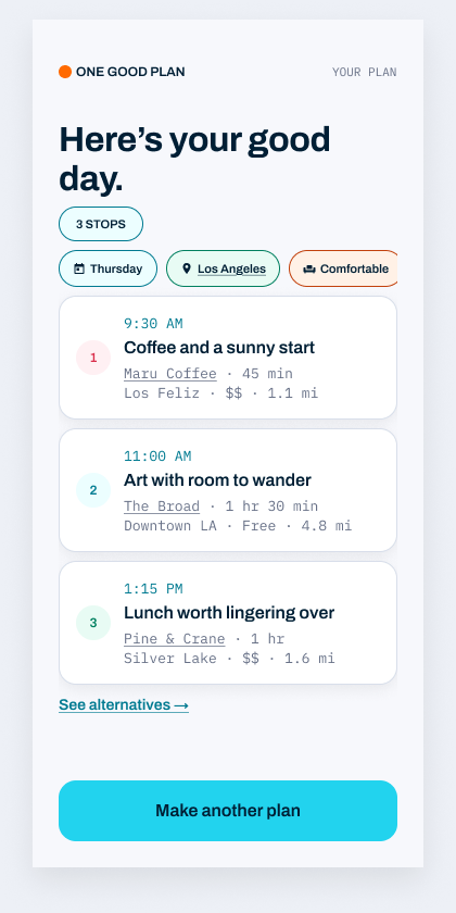
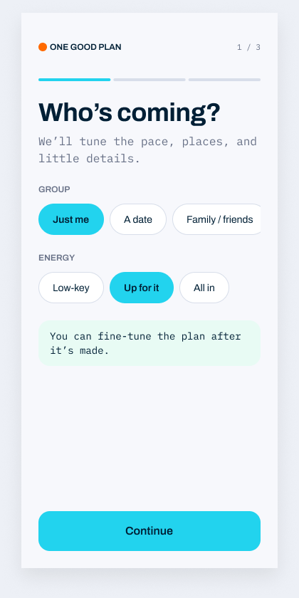
The screens show the deliberate handoff from intent to action. A small set of questions establishes the moment, the itinerary gives each stop a reason and a place in the day, and the surprise route offers a faster path when exploration matters more than control. The design keeps alternatives visible so the plan is useful without feeling rigid.
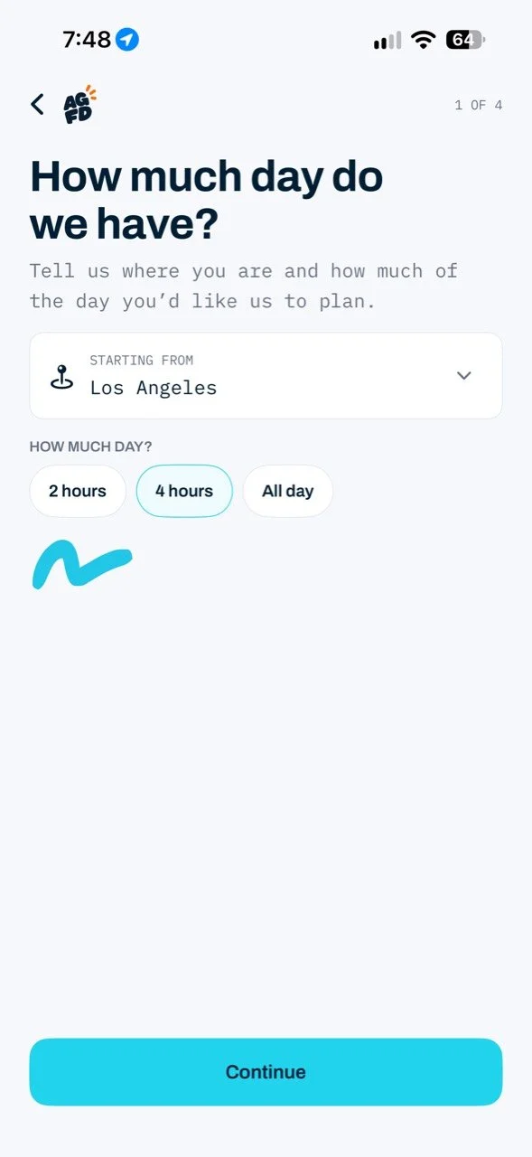
The first screen shows the current A Good Fckn Day beta. The following flow screens are earlier design explorations under the working name One Good Plan.
From “what should we do?” to a day you can actually take.
The product narrows a broad, open-ended question into a few useful constraints, then returns distinct plans with enough detail to act—not another long list to sort through.
Ask only what changes the plan.
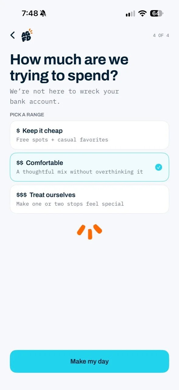
Location and available time define the canvas. A comfortable spending range keeps the suggestions realistic without asking people to calculate an exact budget. The four-step setup also considers company and energy, so the resulting day reflects the moment rather than a generic “nearby” feed.
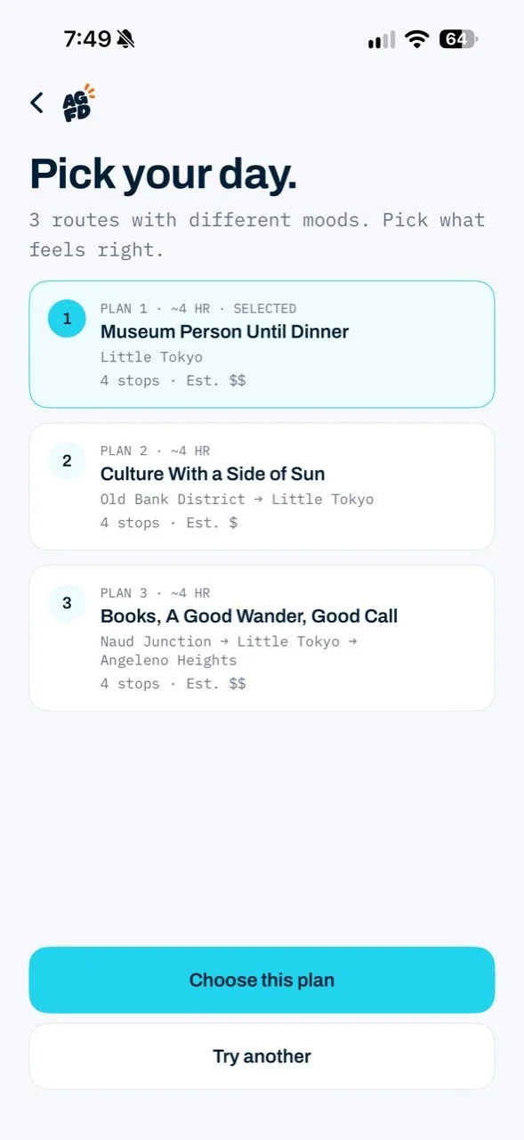
Three directions, not endless results.
Once the plan is generated, people see three routes with different moods. Each option makes time, area, number of stops, and estimated spend visible before they commit. “Try another” keeps the experience exploratory without making them repeat setup.
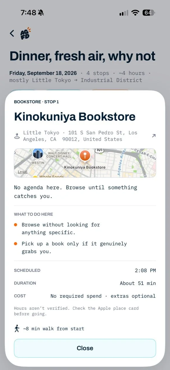
Make the handoff from inspiration to action clear.
The selected itinerary sequences stops with approximate timing and travel between them. A place-detail sheet answers the next practical questions—where it is, what to do, how long to stay, and what to check before going. Calendar and sharing actions live with the plan, where they become useful.

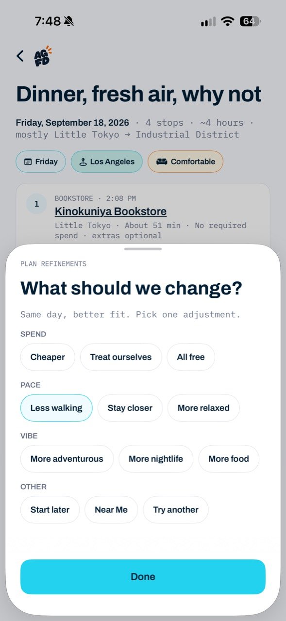
A better fit should not mean starting over.
The refinement sheet turns a vague dislike into one specific adjustment: spend, pace, vibe, or timing. The app can then offer another coherent day while preserving the original context. This is the central product judgment: leave room for spontaneity without giving up control.
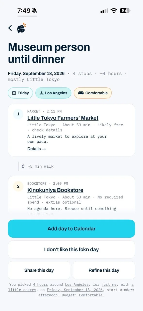
Separate the design hypothesis from evidence.
I framed the planning problem around four tasks in the experience: set constraints, compare complete options, understand the route, and adapt when it does not feel right. The beta makes those hypotheses testable; it is not yet evidence of improved real-world planning outcomes.
Next validation: observe people planning a local or travel day on a physical device; test whether the four questions feel worthwhile, whether the three plans are meaningfully different, and whether refinement helps them reach a plan they would actually take. Track time to a chosen plan, comprehension of cost and travel, and where people abandon or regenerate.
The screenshots above are from the current iOS beta. Locations, opening hours, and costs shown in the demo should be checked before a real trip.
Motion that explains what is happening.
The introduction reveals the product’s value propositions in sequence, giving the typography and voice room to establish the premise. During generation, a small moving highlight shows that the system is working; a subtle haptic cue reinforces the transition on-device, though it cannot be felt in the recording. Both clips are short demonstrations of the real beta, not conceptual animation.
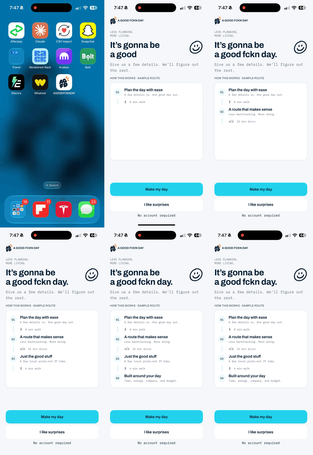
Introduction: value propositions appear in sequence, using motion and typography to set the tone before planning begins.
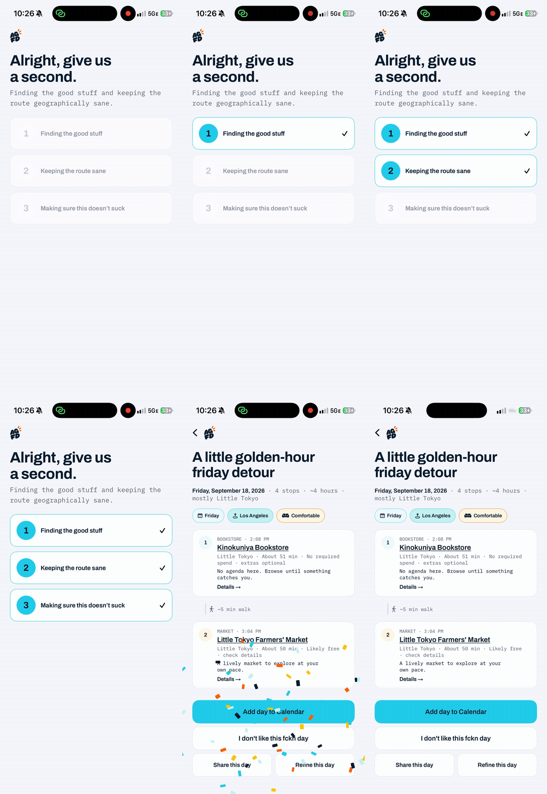
Generation: a moving highlight makes the wait legible. A subtle haptic cue marks progress on the physical device; it cannot be felt in this animation.