Earthwardly
A personal field guide for small acts of care, with a notebook designed to unfold.
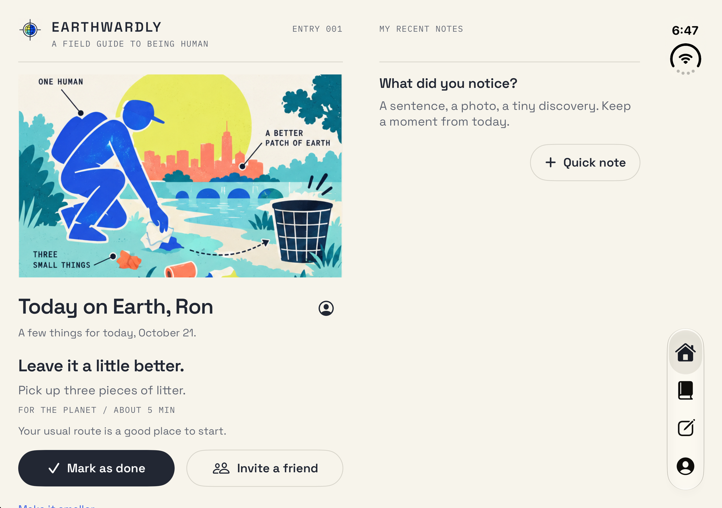
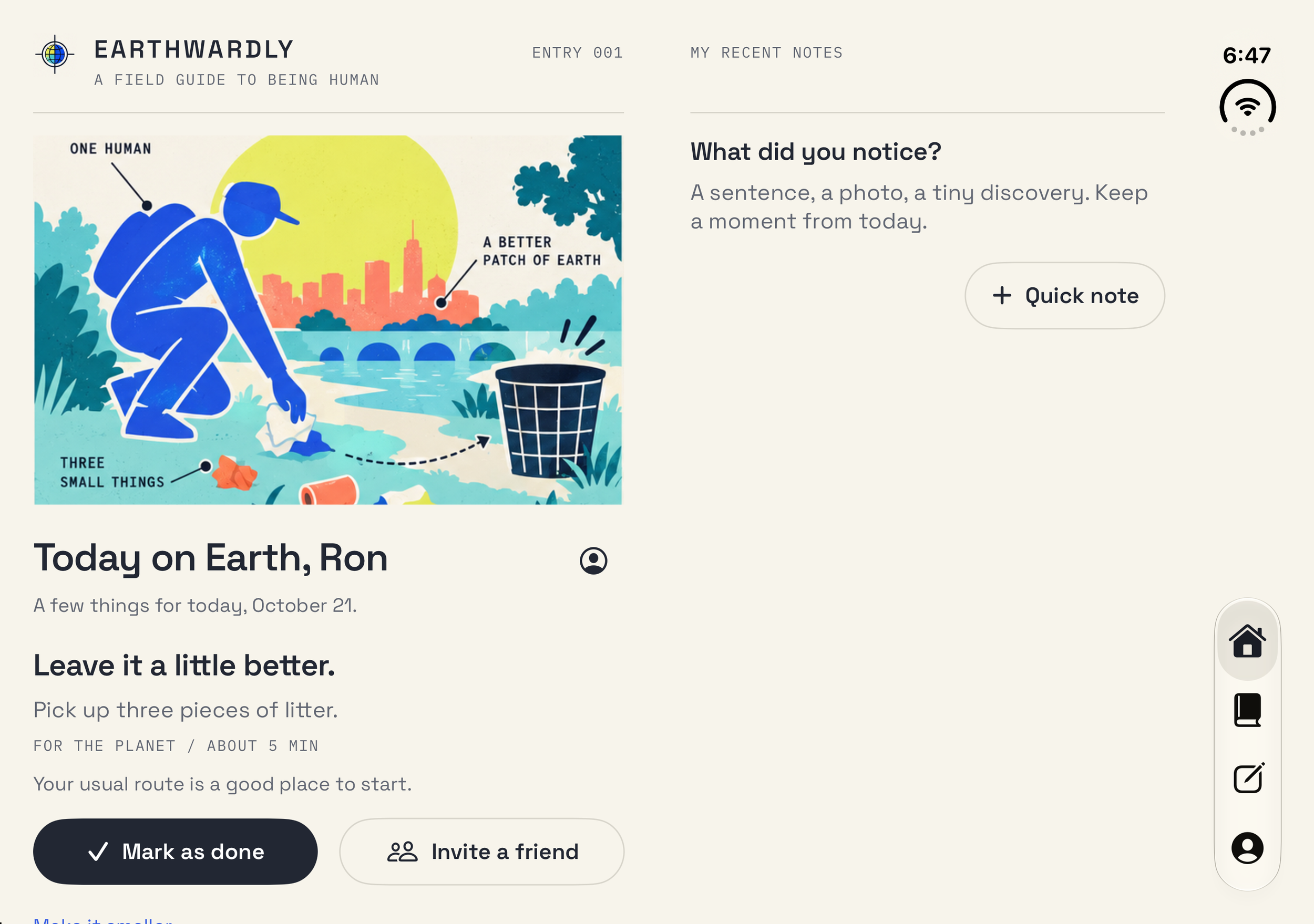
Earthwardly brings everyday actions and personal observations into one native experience. It offers a gentle place to begin, whether that means taking a short walk, making time for someone, or noticing a small detail worth keeping.
I led product design and agentic engineering across the product model, identity, information architecture, interaction design, and SwiftUI implementation. The work centered on a practical question: how can a personal field guide feel focused on a phone and become more useful, not merely larger, on iPhone Duo?
- Role
- Product Designer and Agentic Engineer
- Platforms
- iPhone Duo, iPhone, and iPad
- Product scope
- Daily activities, personal field notes, planning, and optional on device guidance
- Design system
- Space Grotesk, IBM Plex Mono, original editorial illustrations, shared spacing and motion
- Engineering
- Native SwiftUI, adaptive layout, local persistence, media capture, and explicit action confirmation
Product framing
Make care feel possible, not prescribed.
I wanted to connect good intentions with actions that fit an ordinary day. The product needed a useful starting point without becoming another system of obligations.
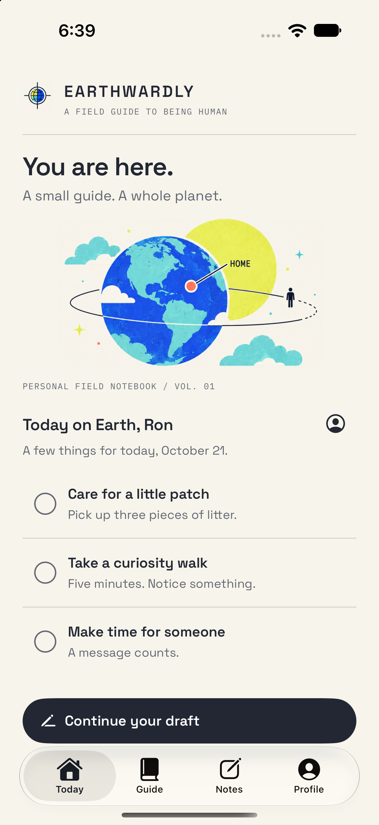
That led to a simple loop: find a small action, make it your own, and keep what you noticed. Completion does not require a photograph, reflection, or proof. A note can stand on its own, without an achievement attached.
Today keeps the next step visible. Completion is reversible, and empty days are treated neutrally. Those decisions express the product's position through behavior: support agency rather than score whether someone has been good enough.
Information architecture
Connect discovery, action, and reflection.
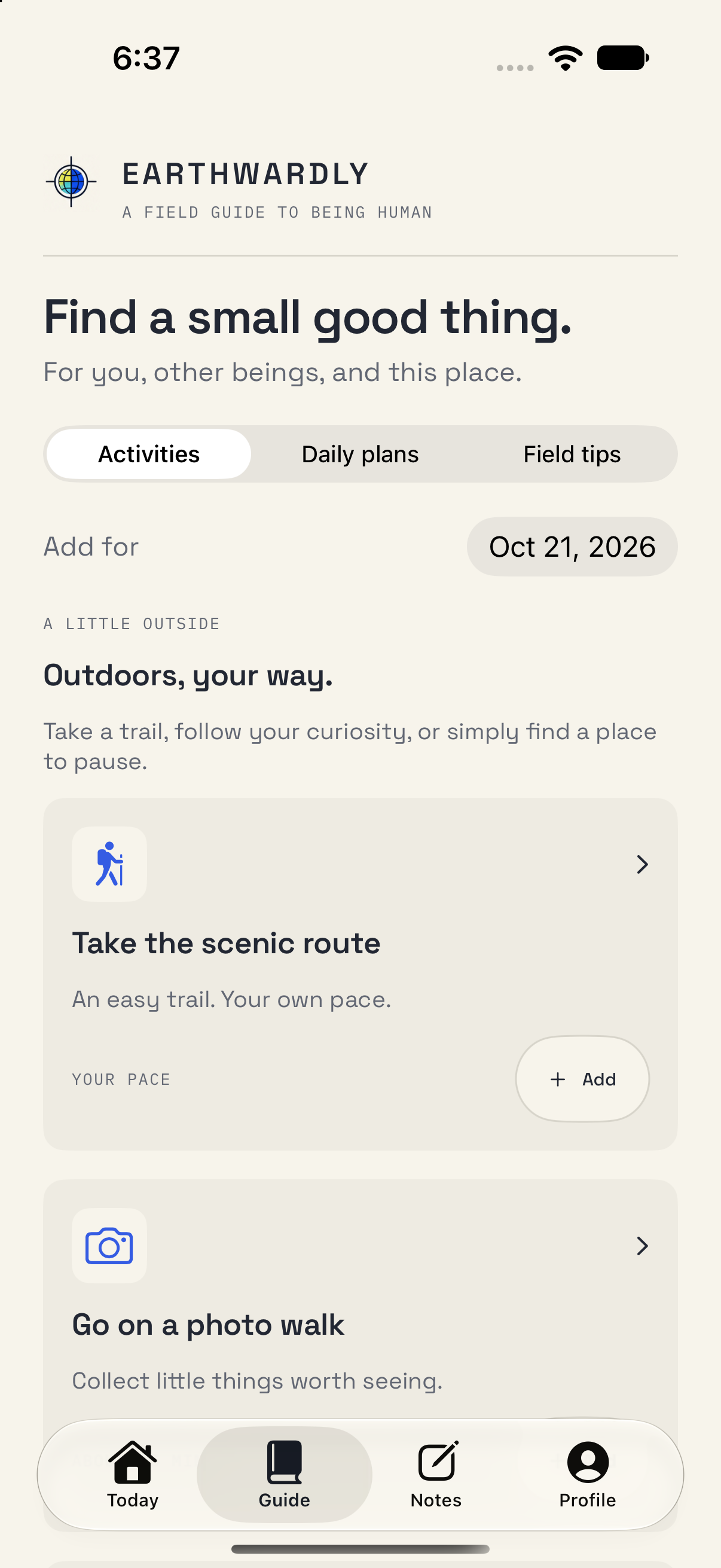
I organized the core experience around Today, Guide, and Notes. Each has a distinct job: understand the day, find something useful, and retain a personal record.
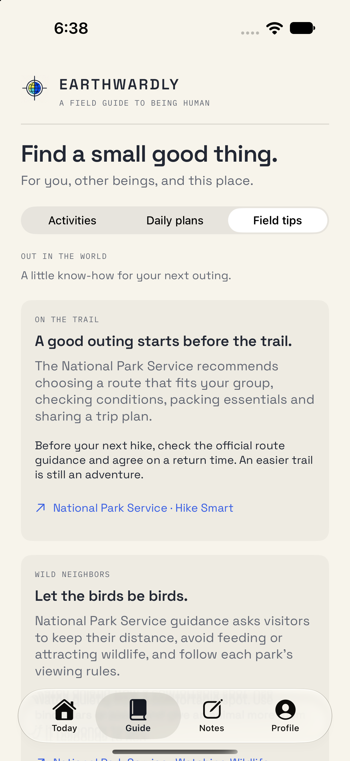
Guide brings activities, prepared plans, and sourced field tips into a shared browsing structure. Activities can become part of a selected day; a field tip remains reference material rather than another task to complete.
The labels, date controls, and action hierarchy are consistent across these routes. This keeps a small decision, such as adding an activity, close to its context instead of sending someone through a separate planning tool.
Adaptive product design
Use the extra space only when it improves the task.
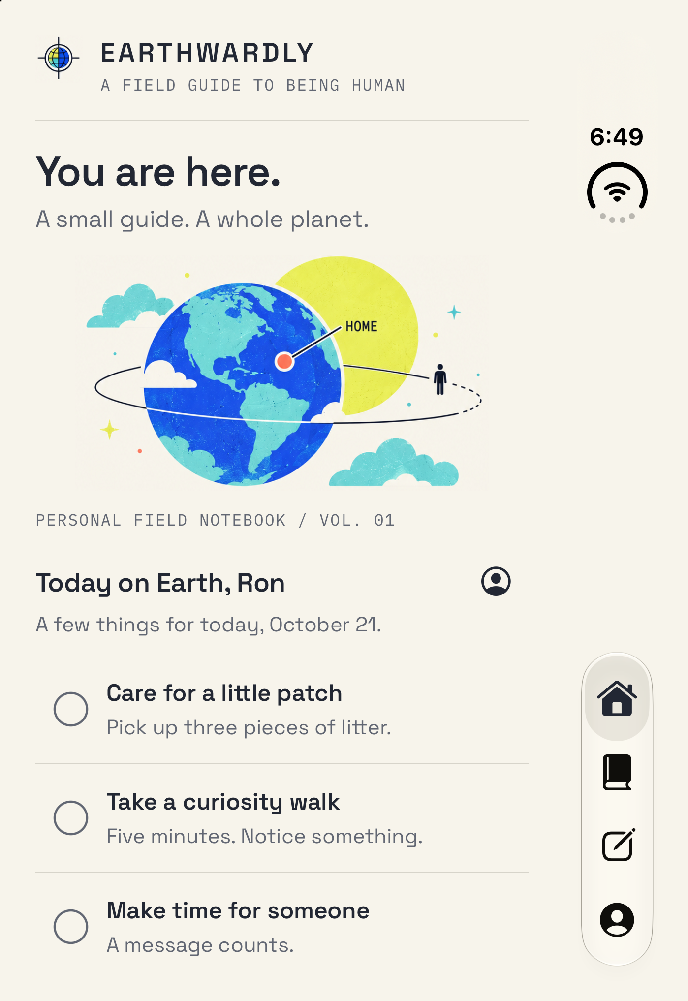
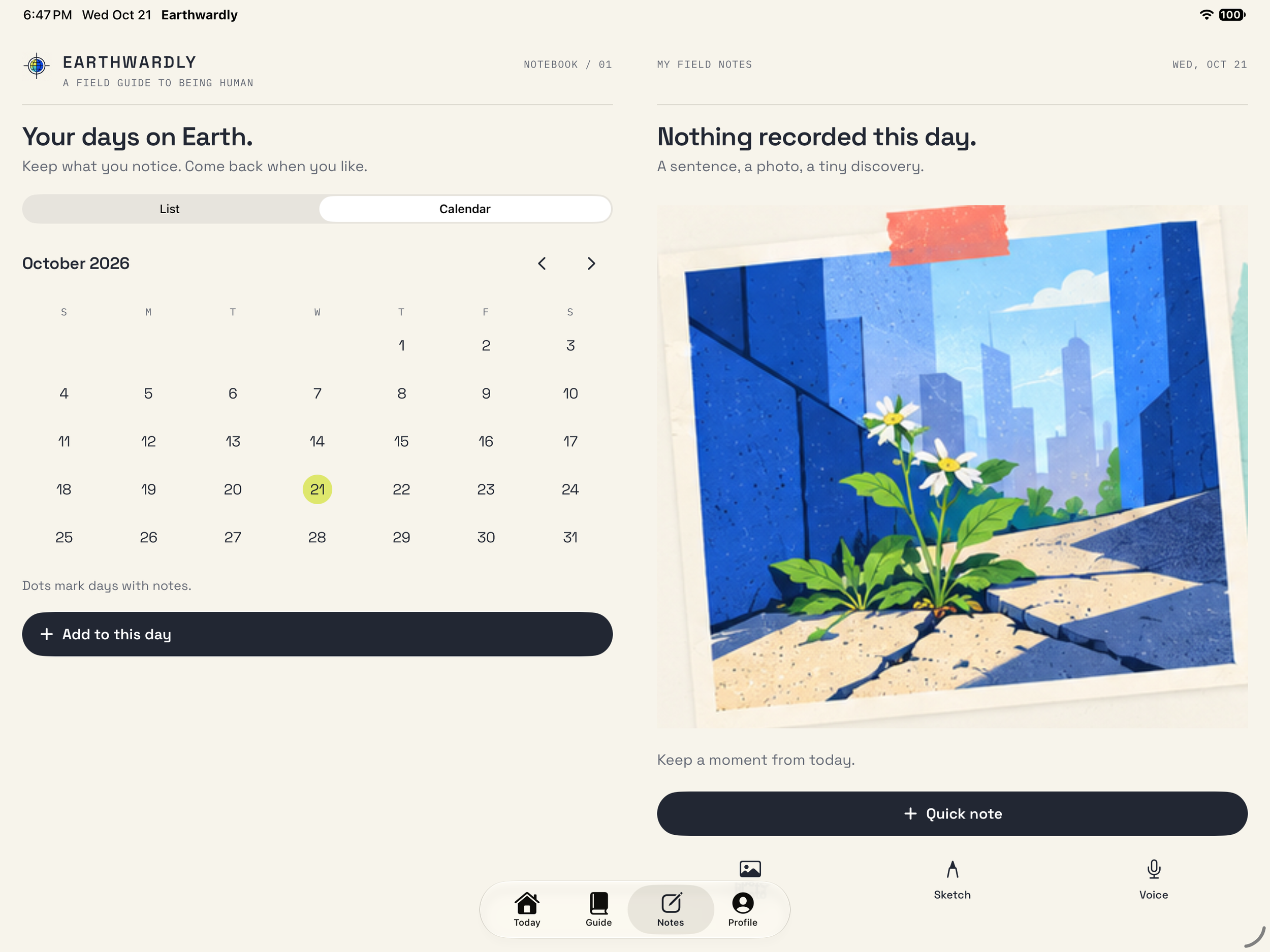
The Duo experience is not a stretched phone interface. In landscape, Today and Notes can place the primary task beside companion context. The compact cover keeps the same product model in a focused sequence.
I deliberately avoided applying the book metaphor everywhere. Guide is a continuous browsing task, so it uses the available surface. A horizontal crease should not split a continuous reading task into two artificial pages.
The layout separates physical display geometry from navigation space. It accounts for active divisions, usable regions, orientation, larger text, and system toolbar placement. Selected dates, active notes, drafts, and reading anchors belong to the experience rather than a particular arrangement of views.
Notebook experience
Give a moment somewhere to land.
Calendar and list are two views of the same notebook, not separate destinations. A selected date carries its notes and observations with it, while a wider display can keep the day and its contents visible together.
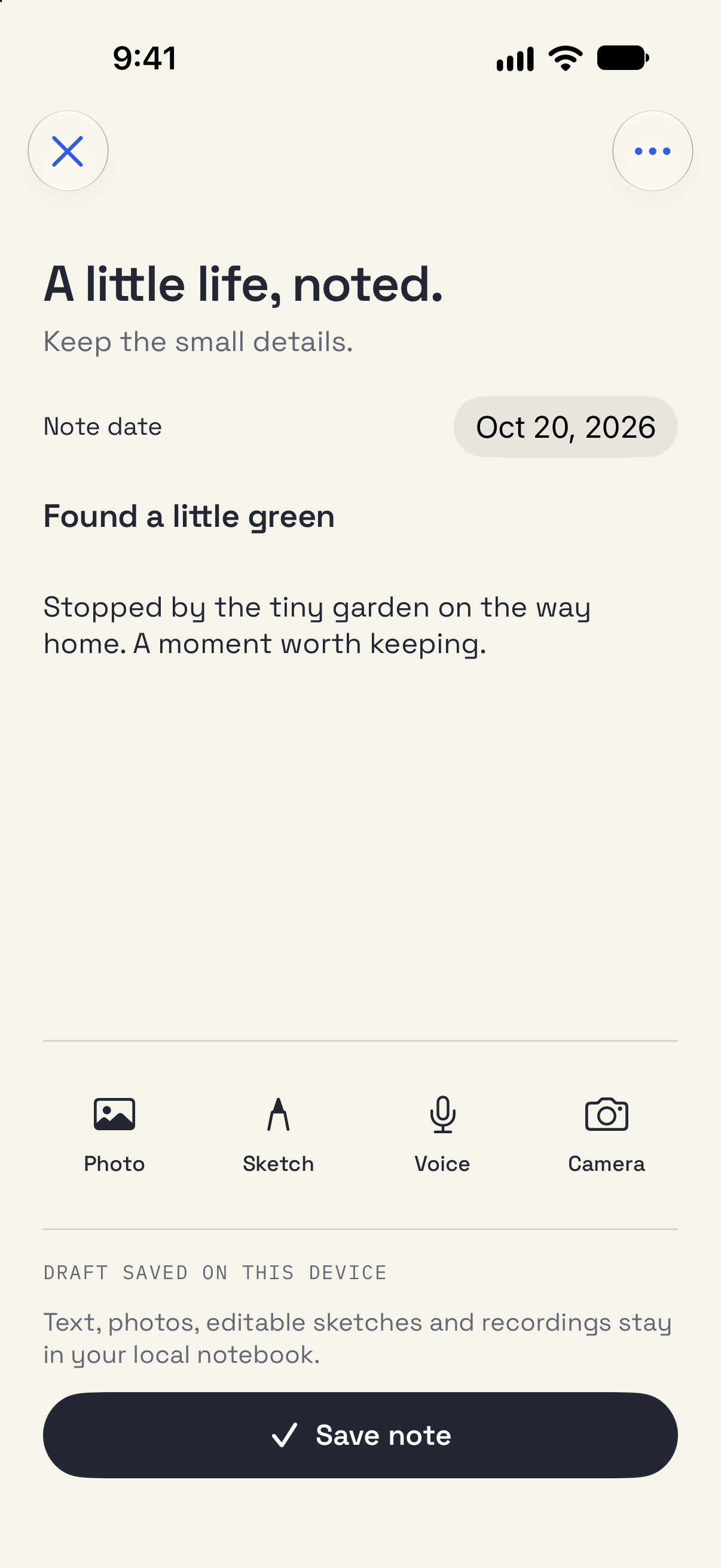
The editor supports text, photographs, camera capture, editable sketches, and local voice recordings. These are alternative ways to keep a moment, not a sequence of requirements.
I treated unfinished work as valuable product state. Capture is reviewed before it is kept, canceling returns to the existing draft, and save feedback follows a successful write. A conflict with another draft is explicit rather than silently replacing someone's work.
Identity and design system
An expressive field guide with a dependable rhythm.
The identity combines a warm paper surface, original illustrated diagrams, and precise editorial labels. Space Grotesk carries the reading experience; IBM Plex Mono gives dates and field guide details their own voice.
I translated that direction into reusable typography roles, spacing, controls, target sizes, and motion rules. An activity card, calendar, form, and illustrated scene can feel related without using the same layout.
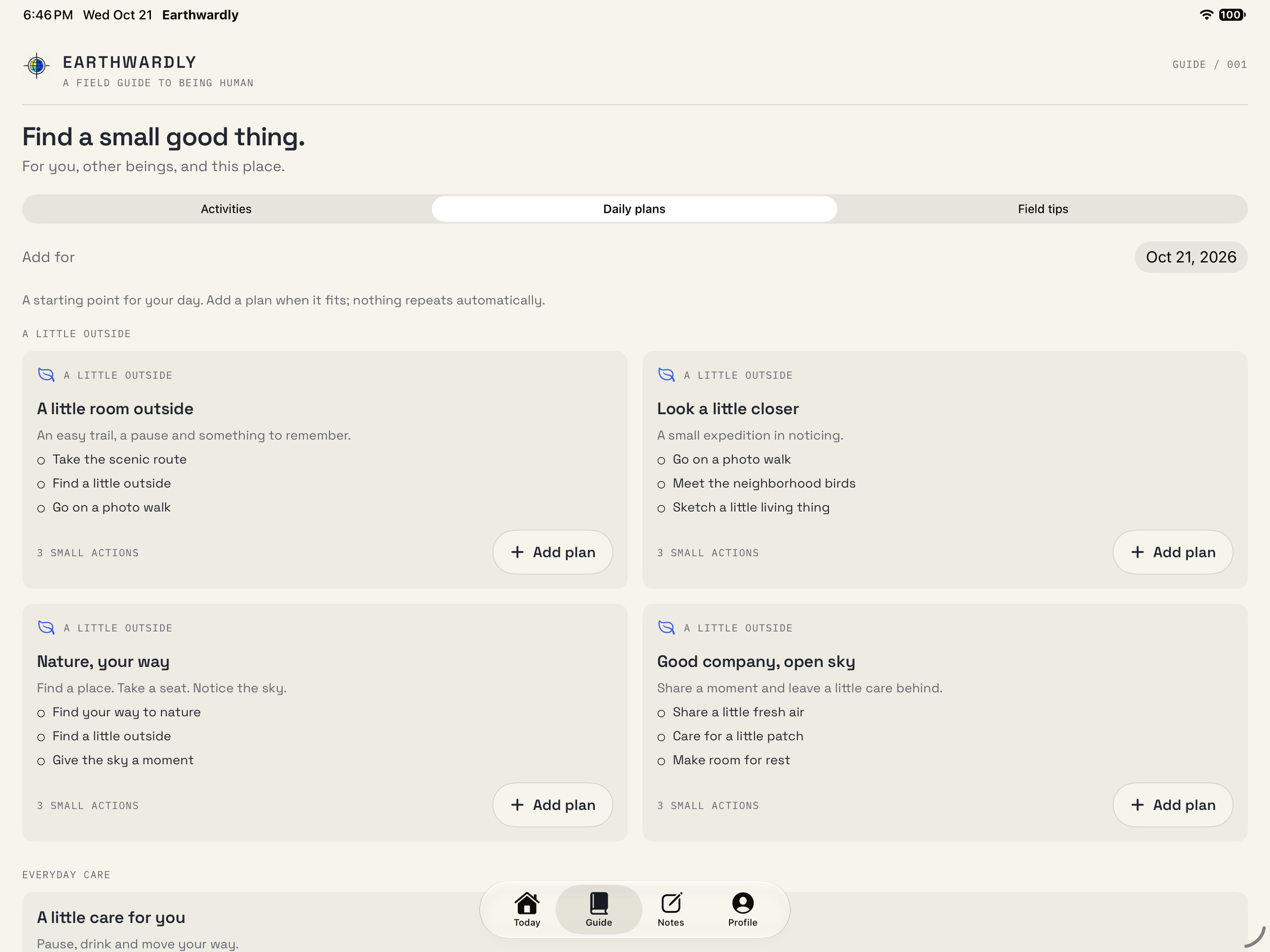
Prepared plans demonstrate the system at a larger scale: repeated cards preserve hierarchy while the content changes. The visual character stays playful, but the mechanics remain predictable.
AI interaction design
Conversation is not permission to act.
The optional coach follows the same principle as the notebook: help someone decide without quietly deciding for them. It uses on device models on supported configurations and deliberately bounded context.
I separated reflection and explanation from concrete recommendations. Ordinary conversation does not automatically generate an activity button. A useful recommendation carries a specific step, with review and confirmation before it becomes a note or a planned activity.
The handoff preserves the tailored suggestion rather than substituting a generic template. Private journal entries and Health readings stay outside the coach's context. Consent, cancellation, and exact content transfer are part of the interaction design, not details delegated to implementation.
Agentic engineering
Carry the product rules into native behavior.
As Product Designer and Agentic Engineer, I worked across design intent and implementation. I defined the expected behavior, directed focused implementation tasks, and reviewed the result against the same product rules.
That included details beyond the ideal path: atomic local saves, recoverable drafts, persistent Undo, attachment cancellation, larger text, Reduce Motion, and layout changes around a division.
Validation combined focused simulator checks with live model scenarios. The evidence supported specific behaviors, such as reopening a note or confirming an exact recommendation, rather than a blanket promise of quality. This made the engineering process another way to examine the UX decisions.
Interaction design
Small feedback. A clear sense of progress.
The recording shows a chosen action completing in the native iPhone app. The illustration changes with the saved state, and a clear confirmation makes the result visible without interrupting the next action.
Completion remains reversible. The larger interaction system also supports a quiet celebration when the chosen day is complete, with Reduce Motion preserving the meaning of each state change.
Recorded from the native iOS app with sample content. Play to view the interaction.
What the work demonstrates
The interface can change without changing the task.
Earthwardly brought product framing, identity, adaptive layout, and native interaction into one coherent system. Its clearest expression is not the larger display; it is a personal action or unfinished thought that remains intact as the interface changes around it.
The work reinforced how much product quality lives between screens: what survives a canceled action, what requires confirmation, and what the system chooses not to infer.