
Superfind
Finding your people should not depend on a perfect signal.
Superfind is a native festival companion for nearby discovery, private conversations, and practical plans. I shaped the product from its information architecture and visual identity through SwiftUI implementation and interaction quality.
The challenge was not simply putting friends on a map. It was helping someone understand who they can reach, what information is current, and what they are choosing to share when connectivity is unpredictable. I treated those questions as one connected product problem, with trust built into both the interface and the underlying behavior.
- Role
- Product Designer and Agentic Engineer
- Platform
- Native iOS · SwiftUI
- Product scope
- Nearby discovery, messaging, location consent, and festival planning
- Design system
- Brand identity, shared interface patterns, adaptive typography, and native motion
- Engineering focus
- Local data, authenticated private communication, explicit consent, and verification
Product architecture
Start with the person, not the radio.
Festivals are demanding environments for coordination: people move between stages, plans change, and a message that looks sent can create false confidence if it never reaches the other person. The experience needed to connect discovery to a useful next action, not become another feed.
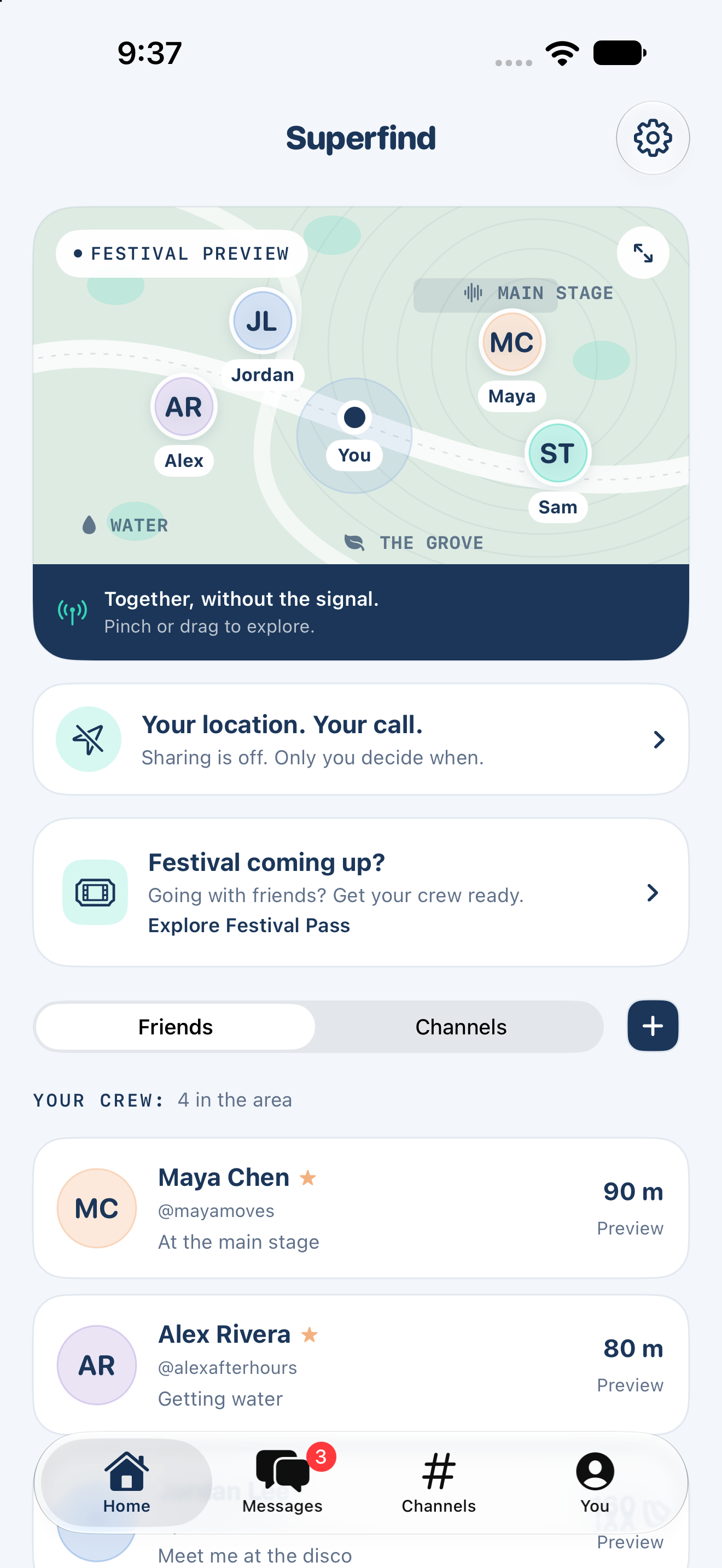
I organized the product into four focused destinations: Home, Messages, Channels, and You. Home combines the nearby map, an obvious entry to sharing controls, and the crew list. Both map pins and friend rows open a direct conversation. Search and message filters make returning to an exchange easy without turning Home into a second inbox.
Bluetooth, location, and contacts choices are staged rather than bundled into one permission wall. A person can explore a labeled sample festival before granting access. Contact invitations use the system picker and composer, so inviting one friend does not require sharing an address book with the product.
Privacy and trust
Sharing is a decision, not a side effect.
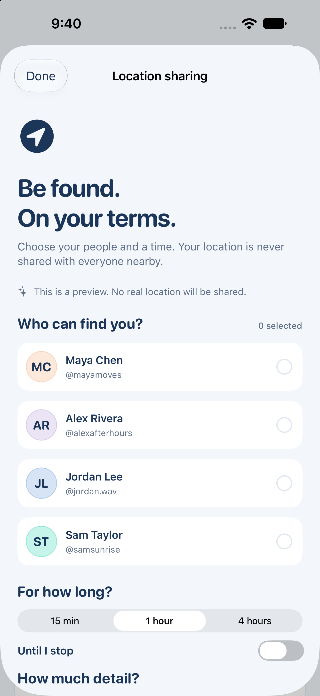
Location is off by default. Verifying a contact or joining a channel does not turn it on. The sharing flow asks who should receive a position, for how long, and at what level of detail. Approximate and precise location are separate choices, and stopping remains available.
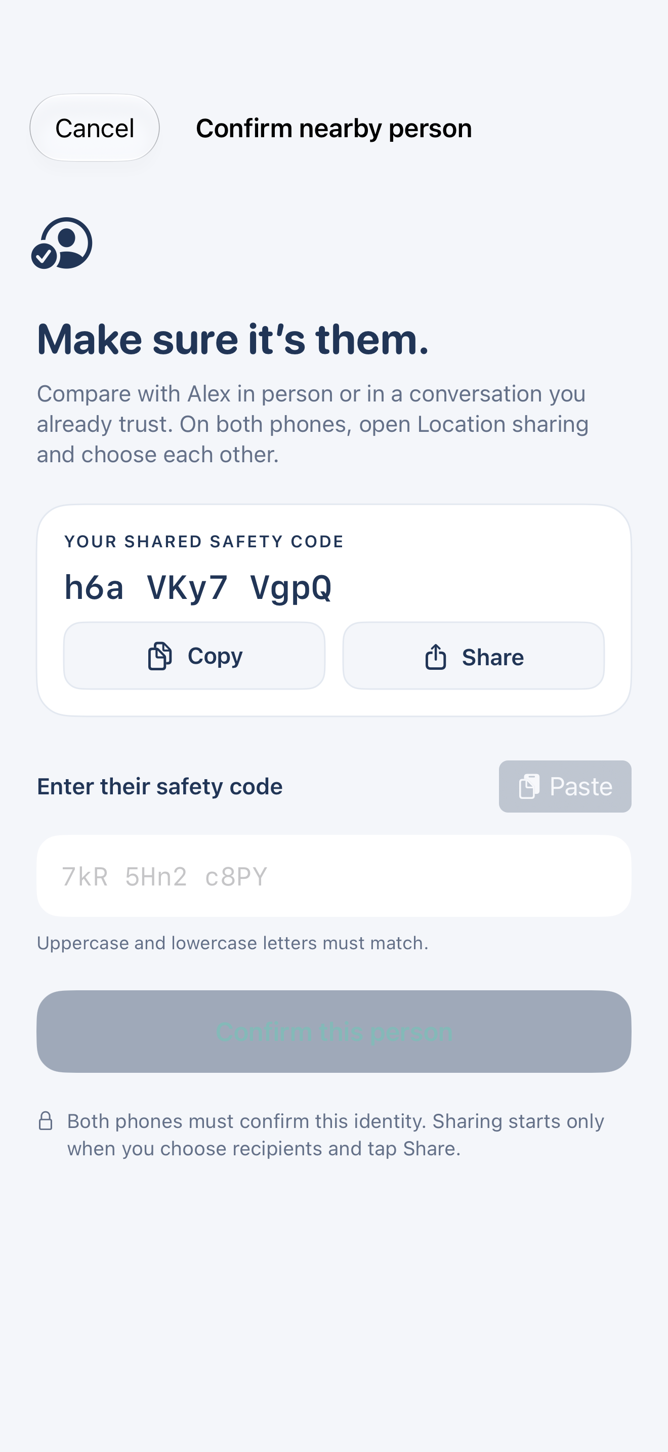
I separated identity verification from permission. A remembered contact can establish who a message is for, but does not grant ongoing location access. Restarting the app does not silently restore a sharing grant, and received positions expire rather than becoming a permanent trail in message history. The interaction reduces a complex privacy model to concrete choices people can understand.
Information clarity
Tell the truth about connection and delivery.
Waiting, attempted broadcast, locally saved content, and authenticated private delivery are different states. I designed status language around what the system can confirm rather than using the same reassuring checkmark for everything. The model distinguishes foreground nearby communication from separately saved maps, with no assumption of background delivery.
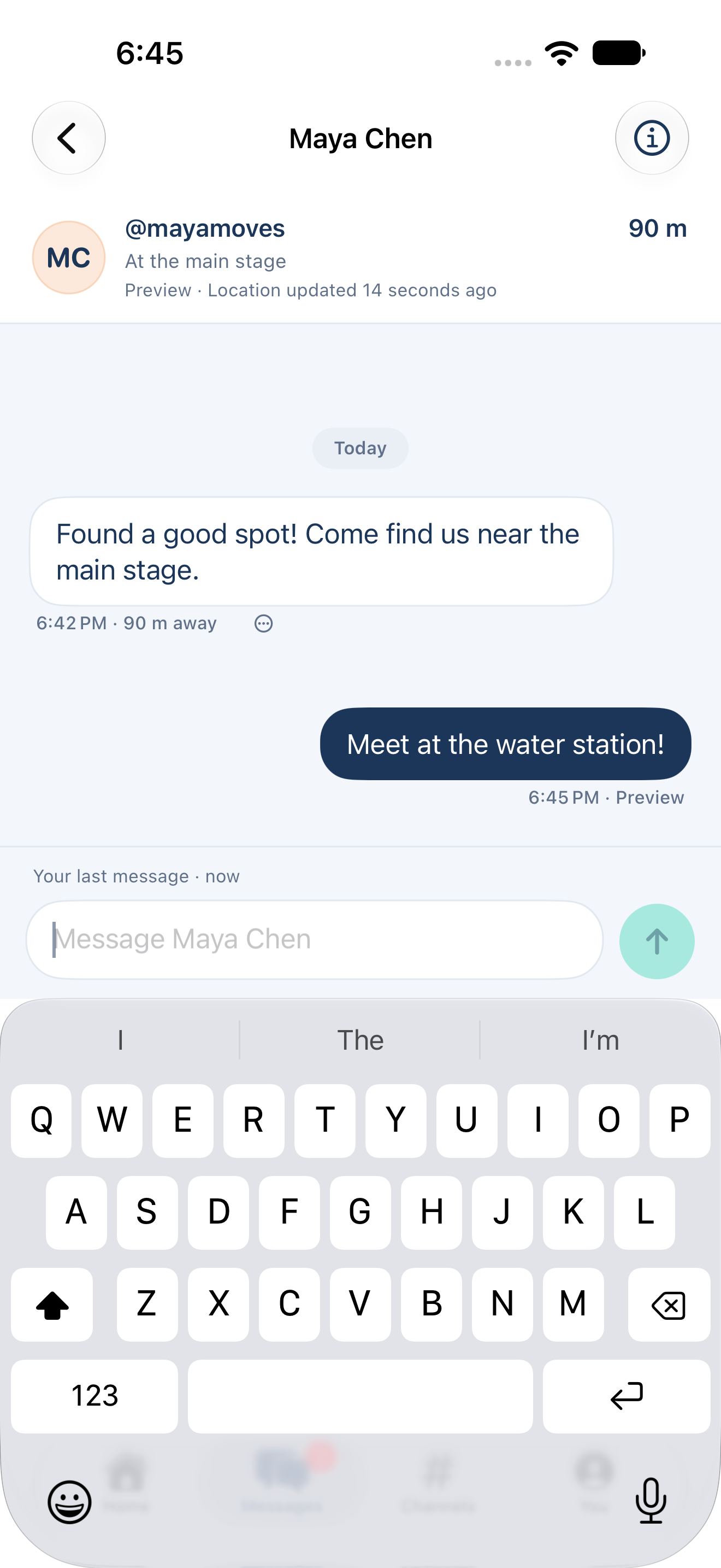
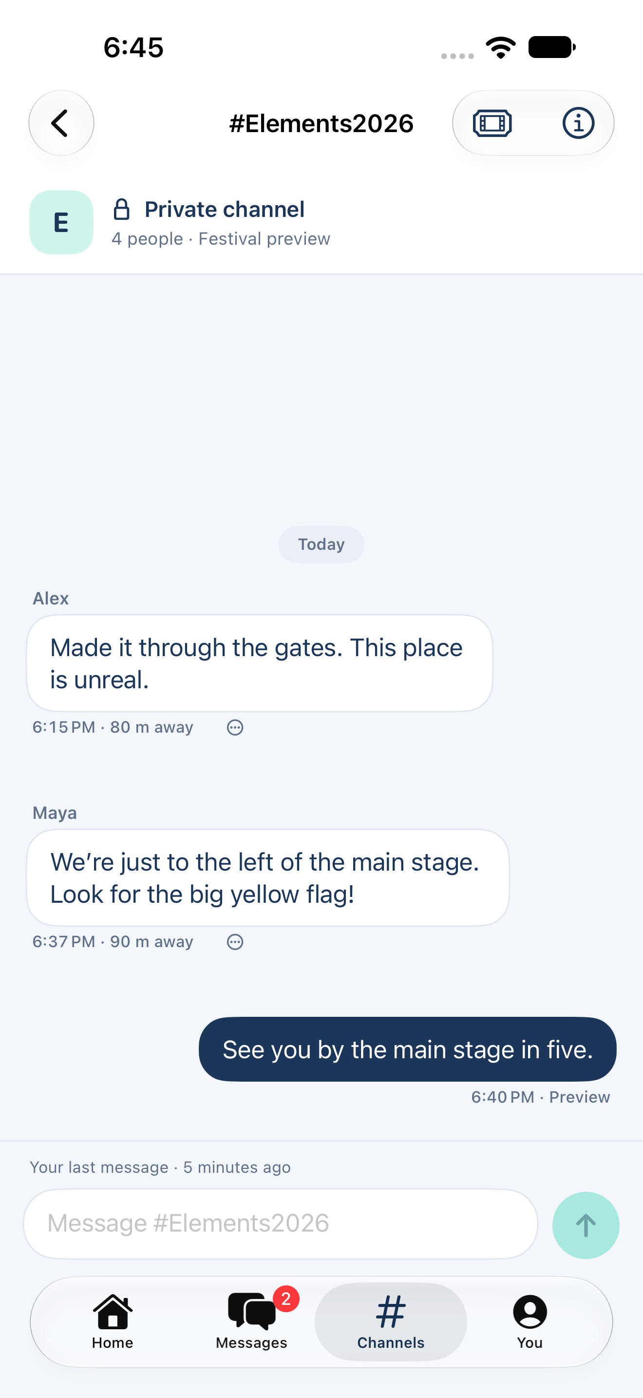
Conversation metadata places time, distance, and freshness near the message. When a location is not eligible to be shown, the interface says so instead of presenting an old distance as certainty. Distances use coordinates and accuracy, not Bluetooth signal strength disguised as precision. This was a design and engineering decision: transport, consent, and display rules had to agree.
System expansion
A good plan can matter more than a live dot.
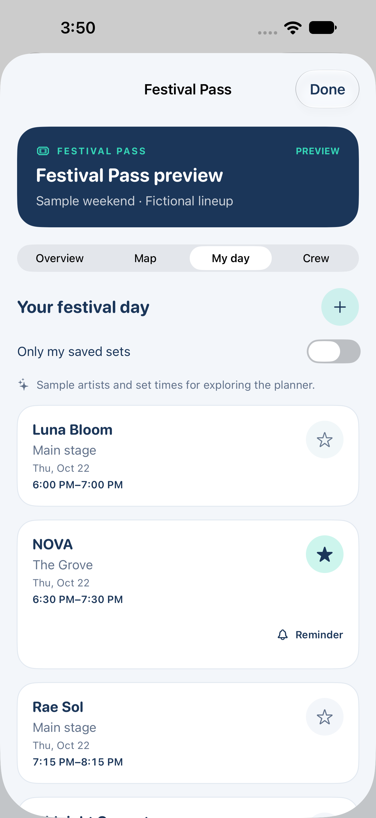
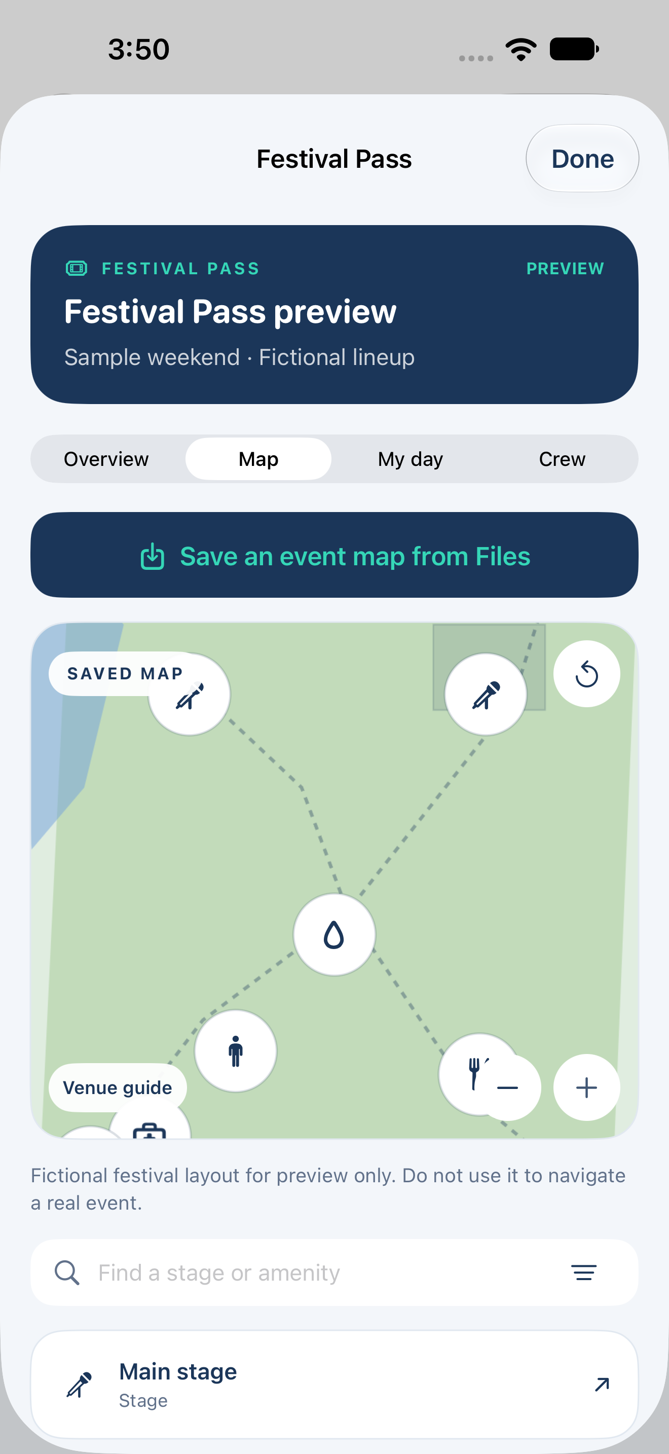
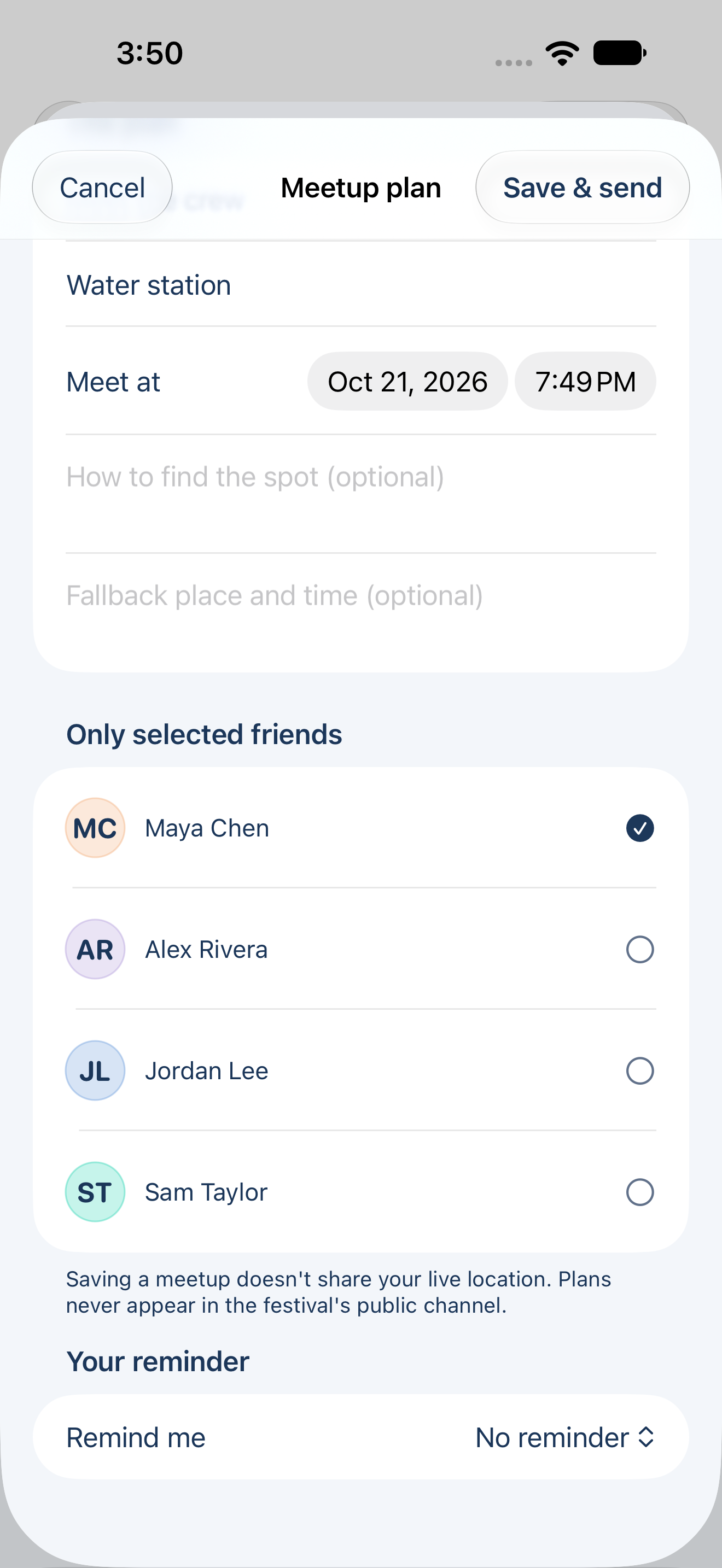
Festival Pass adds saved venue guides, a personal schedule, overlap warnings, and private meetup plans. Overview, Map, My day, and Crew extend the existing navigation instead of introducing a separate product model.
A meetup can name a landmark, a time, instructions, and a fallback without enabling location sharing. Schedules go only to selected verified friends. Large map resources are saved before arrival, while nearby communication carries small messages and private plan updates. I also kept core communication and the ability to stop a disclosure outside the paid access boundary. Privacy must remain easy to undo.
Visual and interaction design
A calm system for a busy environment.
The navy and mint identity pairs a distinctive navigation mark with quiet surfaces, rounded typography, consistent cards, and native controls. Shared tokens and reusable patterns carry through onboarding, maps, conversations, and planning, including light and dark appearances.
Motion reinforces the spatial model. Bounded pan and zoom preserve orientation; selecting a person moves into a purposeful conversation. A restrained spring gives controls a consistent feel, with optional animation removed for Reduce Motion. Dynamic Type, native safe areas, accessible labels, and generous hit targets are part of the system, not a separate finishing pass.

Development and verification
Own the decisions. Verify the behavior.
I worked as Product Designer and Agentic Engineer, using AI agents as implementation collaborators while setting requirements, defining boundaries, prioritizing changes, and reviewing the result. Bounded tasks and preserved references helped keep the product coherent as its capabilities grew.
The workflow combined native implementation, visual review, and automated checks. Verification exercised consent expiry, selected recipient boundaries, replay handling, local persistence, map freshness, and key interface journeys. The latest protocol and domain verification passed 246 logic tests. I treated those results as engineering evidence, not a substitute for observing people or validating radio behavior in the field.
Interaction design
From nearby context to conversation.
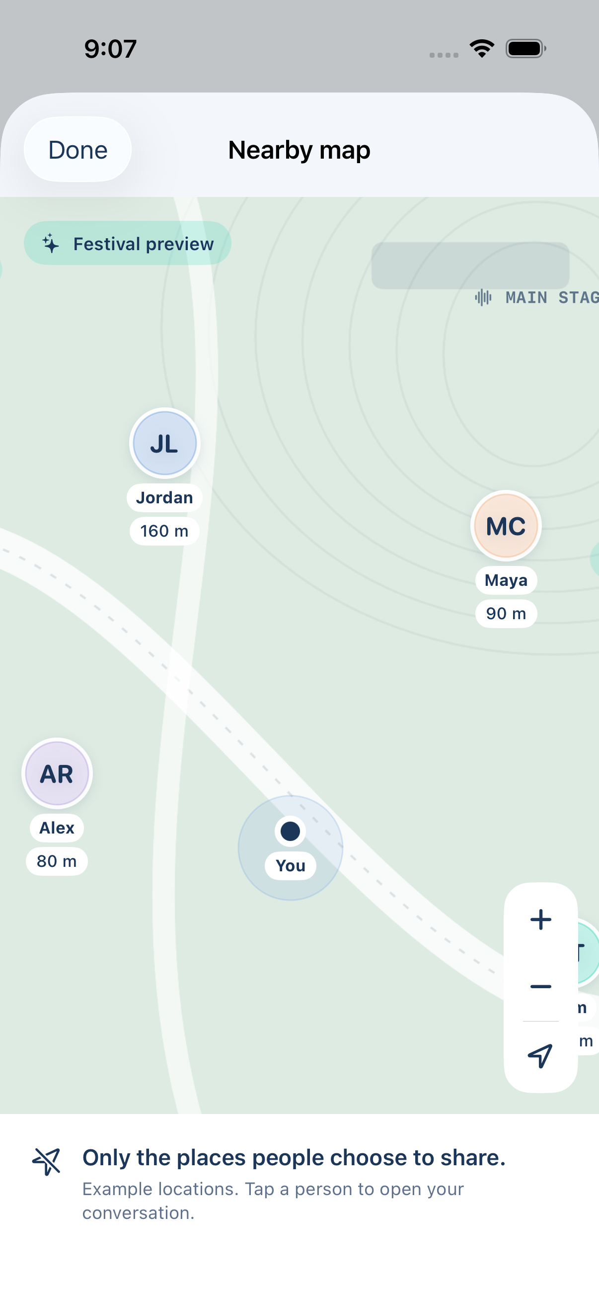
The recording shows the actual native product moving from Home into the expanded map and then a direct conversation. Zoom, selection, and navigation serve one continuous task: understanding where someone is and contacting them without losing context. The visible sample labels distinguish the demonstration from live sharing.
Recorded from the native iOS app with sample content. Play to view the interaction.
What the work demonstrates
The interface and the system need to tell the same story.
Superfind brought product direction, a distinctive identity, native interaction craft, and engineering constraints into one set of decisions. The most important design work was making complex behavior understandable without hiding its limits. A clear sharing model, honest status language, and purposeful navigation make the experience coherent beyond any individual screen.